
Company Widget Feature
The Company Widget is your organisation's public face for privacy contact. It is a small but important panel that can be embedded on your website or within DPMS-hosted assessment flows, showing visitors your DPO's email address, a phone number, a branded header message, and optional action buttons — for example, a "Submit a Data Request" link or a calendar booking button. This screen is where you build, update, and activate that panel. Because there is exactly one widget per company, this is a singleton settings screen rather than a list of records. Changes you make here affect every public surface where the widget is deployed, so the people who typically work here are compliance officers, DPOs, and IT administrators who own the organisation's privacy contact configuration.
How to open it
In the left-hand sidebar, navigate to Compliance Settings, then look for Widget in the sub-navigation panel that appears. Click Widget to open the read-only detail view.
Heads up: If you see a "403 Forbidden" page instead of the widget screen, your account does not have permission to view this area. Ask your DPMS administrator to grant you the Compliance Settings Widget read permission. Editing requires a separate edit permission — without it, the Edit button will be greyed out.What you see
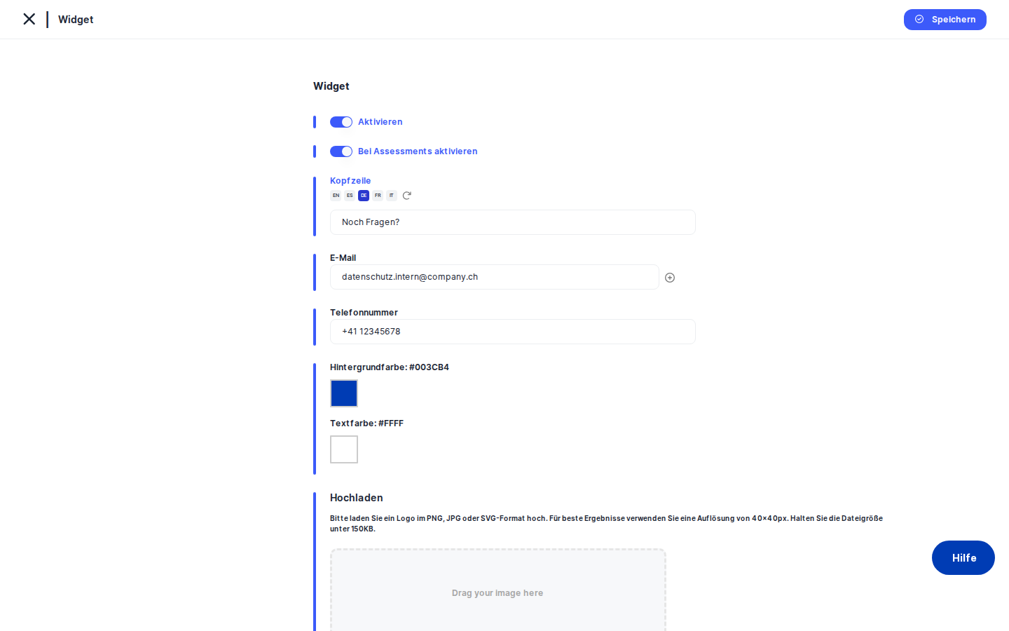
When you arrive on the widget screen, you land on the read-only detail view — a clean card labelled Widget that shows all currently saved settings in a two-column layout: field labels on the left, their values on the right. You can see at a glance whether the widget is currently active, what email addresses are configured, the phone number, header text, chosen brand colours, and any configured action buttons. An Edit button sits at the top-right of the card.
Until you click Edit, nothing here is changeable. The read-only view is your quick reference — useful for audits, change reviews, or simply confirming what visitors currently see.
Clicking Edit takes you to the edit form, where all the same fields become interactive. The form is presented as a vertical stack inside a card with a blue accent bar on the left — the standard DPMS edit layout. A Save button commits your changes and returns you to the read-only view; the back arrow in the breadcrumb area discards any changes and takes you back without saving.
Working with this screen
Activating the widget for the first time
If your organisation has never used the widget, the read-only view will show the Activate status as inactive. Here is how to bring it live:
- Click
Editin the top-right of the Widget card. - Toggle Activate to ON — the switch turns blue and the remaining fields appear below it.
- In the Email field, type the DPO's contact address (for example,
dpo@company.com). Once you have typed in the first field, a + icon appears to its right — click it to add a second email row if you need a backup address. If you later need to remove an address, click the ✕ icon on that row (it only appears when two or more rows exist). - Optionally enter a Phone Number if you want to offer a direct call option.
- Fill in the Header field with a short greeting or instruction (for example, "Contact our Privacy Team"). Because this field supports multiple languages, you can switch between language variants using the language buttons embedded in the field — each language has its own version of the text.
- Choose your Background Color and Text Color by clicking the colour swatches. A colour picker overlay opens; you can click to select a colour or type a hex value directly. Pick colours that match your brand and ensure the text is legible against the background.
- If you have a company logo or DPO photo to display in the widget, drag it into the image upload area or click to browse. Accepted formats are JPEG, PNG, and SVG, with a maximum file size of 150 KB.
- When you are ready, click
Save. DPMS validates your email addresses and any button URLs, saves the configuration, and returns you to the read-only view showing the widget as active.
Tip: If email validation fails, the email label turns red and saving is blocked. Check that every address follows the standard name@domain.tld format. Remove any empty rows if they appear.Adding action buttons to the widget
Custom action buttons give visitors a one-click path to important privacy resources — a DSAR submission form, a privacy policy page, or a calendar booking tool. The Widget Buttons table at the bottom of the edit form is where you configure these.
Each row in the table has two fields: Label (the text shown on the button) and Link (the URL the button opens). Here is how to set them up:
- In the first row's Label field, type the button text in your default language (for example, "Submit a Request").
- In the Link field, enter the full URL, including the protocol — for example,
https://privacy.company.com/dsar. The URL must start withhttp://orhttps://; relative paths or bare domain names will fail validation. - To add a second button, click the + icon on the right side of the last row. A new blank row appears. Repeat for as many buttons as you need.
- To remove a button, click the ✕ icon on that row. The icon only appears when two or more rows exist.
- To generate translations of your button labels automatically, use the language selector buttons in the Label column header (the
TranslateButtons). Click the flag or locale code for the language you want to generate, and DPMS will call the translation service to fill in the label for every button row in that language simultaneously. A "Translating…" placeholder appears in the fields while the translation is running. - Click
Savewhen done. If any Link field contains an invalid URL and the widget is active, that field turns red and the save is blocked.
Heads up: If you leave both the Label and Link fields in the only remaining row completely blank, DPMS treats this as "no buttons configured" and saves without error. However, filling in just one of the two fields will trigger URL validation and block the save. Either complete both fields or leave both empty.
Updating brand colours
After a brand refresh, you may need to update the widget's colour scheme. This is quick to do:
- Click
Edit. - Make sure
Activateis ON — the colour pickers are hidden when the widget is inactive. - Click the Background Color swatch. The colour picker opens. Select the new colour or type its hex code (for example,
#1A2B3C). - Click the Text Color swatch and adjust it so the text remains readable against the new background. DPMS does not automatically check contrast, so this is a manual step.
- Click
Save.
Temporarily taking the widget offline
If your DPO is unavailable for an extended period or you need to pause the public contact channel for any reason, you can deactivate the widget without losing your configuration:
- Click
Edit. - Toggle Activate to OFF — the switch turns grey, and all other fields disappear from the form.
- Click
Save. The widget is immediately deactivated. The read-only view will show "Inactive."
All your previously saved data — email addresses, phone number, header text, colours, buttons — remains stored in the database. When you are ready to reactivate, come back, toggle Activate to ON, review the fields, and save again.
Tip: After reactivating, always review all fields before saving. Data saved while the widget was inactive was not validated — for example, an email address may have been edited to an invalid format while the widget was off.
Controlling whether the widget appears in assessment flows
By default, activating the widget makes it available on your main public-facing website. If you also want it to appear within DPMS-hosted assessment or questionnaire pages — so that respondents can reach your privacy team mid-assessment — switch on the Activate on Assessment toggle. This secondary toggle only appears when the main Activate switch is ON. Toggle it off again if you want the widget to remain on the main site but not interrupt assessment flows.
Field reference
- Activate — Master on/off switch for the widget. When OFF, the widget does not appear anywhere and no other fields are validated on save.
- Activate on Assessment — Secondary switch (visible only when Activate is ON). Controls whether the widget also appears on DPMS assessment and questionnaire pages.
- Header — Short greeting or instruction text shown at the top of the widget. Supports multiple languages. Visitors see the version that matches their locale; the widget falls back to the default language if no translation exists.
- Email — One or more contact email addresses shown in the widget. At least one valid address is required when the widget is active. Each address must be in standard email format and no longer than 255 characters.
- Phone Number — Optional phone number shown in the widget as an alternative contact method. Maximum 25 characters; any text format is accepted.
- Background Color — Hex colour for the widget's background. Default is
#000(black). Click the swatch to open the colour picker. - Text Color — Hex colour for text inside the widget. Default is white. Click the swatch to open the colour picker.
- Image — Optional logo or avatar displayed in the widget. Accepted formats: JPEG, PNG, SVG. Maximum file size: 150 KB. Only one image can be active at a time.
- Widget Buttons — Label — Display text for a custom action button. Supports multiple languages; use the language selector buttons in the column header to generate translations automatically.
- Widget Buttons — Link — Fully qualified URL for the button (must begin with
http://orhttps://). Validated only when the widget is active and the row is not completely empty.
How this connects to the rest of DPMS
The widget configuration is a standalone singleton — it does not gate or unlock other DPMS features. Its primary effect is entirely on your public-facing surfaces: once activated and saved, the widget becomes available on your website or assessment pages. No other internal DPMS screen reads this configuration.
That said, the widget does plug into two shared DPMS services. The automatic translation pipeline — the same service used across processing activities, records, and other multilingual objects in DPMS — is used here to translate the Header and button labels. The image upload uses a dedicated widget image endpoint, separate from the general document storage used elsewhere in the system.
After you have configured and saved the widget, your next step is typically to verify the rendered output on your public website or assessment portal to confirm the colours, text, and buttons appear as expected. If you later update your DPO's contact details anywhere else in DPMS, remember to also update them here, since the widget is configured independently.
Tips & common pitfalls
Heads up: Clicking the back arrow on the edit form discards all unsaved changes with no warning. There is no "Are you sure?" confirmation. If you have spent time configuring multi-language labels or uploading an image, click Save first.Tip: The widget buttons table always starts with at least one blank row. You are not required to fill it in. Leaving both the Label and Link fields in the only row empty is perfectly valid and means "no buttons." But if you type something in only one of the two fields, the URL validator will fire and block your save.
- URL validation is strict. Button link URLs must begin with
http://orhttps://and include a valid domain. A path like/dsaror a bare domain likeprivacy.company.comwill fail. Always include the full protocol and domain. - Image files must be under 150 KB. If your logo is larger, resize or compress it before uploading. JPEG and PNG formats are the most reliable choice; SVG is allowed but may behave differently depending on the browser context where the widget is embedded.
- Colour defaults may look unexpected. The background colour defaults to black (
#000) and the text colour to a 4-digit hex shorthand that renders as white. If the colour picker shows an unexpected colour when you first open it, manually type a standard 6-digit hex value to set an explicit baseline. - Multiple email addresses are shown comma-separated in the read-only view. To verify that all addresses saved correctly, check the read-only view after saving — all addresses appear joined by commas in the Email row.